Everyone knows that the Pantone’s color of the year is Greenery, but the truth is that we can’t cover our living room all in green right? And now that Spring is arriving and everyone’s already thinking about bright and warm colors, we decided to show you what are the color trends that you should be expecting for this Spring.
SEE ALSO: Living Room Trends That Are Here to Stay
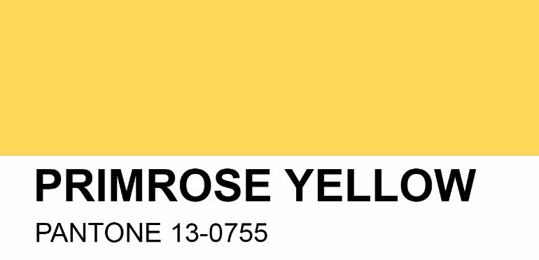
Primrose Yellow
Primrose yellow is one of the colors featured in Pantone’s Spring color report and you know we love it. Why? Because it exudes Spring feelings and warm weather vibes. It’s also an excellent accent color, perfect to use in small details that will surely make your home design pop. See the example below.
Photo ©: Aurelién Brion
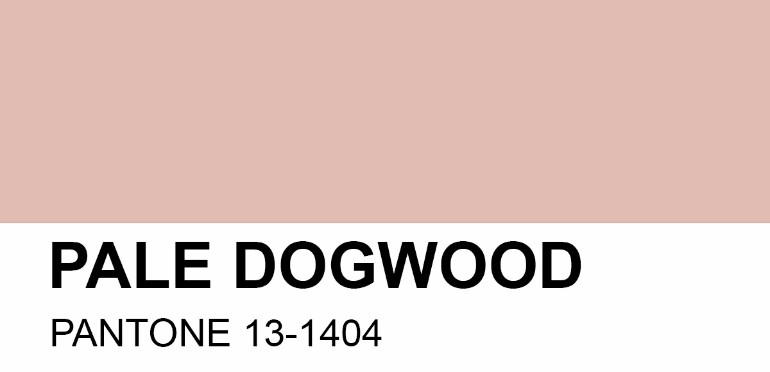
Pale Dogwood
Pale Dogwood is almost a comeback to last year’s color of the year, Rose Quartz. However, this particular shade has a more nude feeling to it, and can be paired with either neutrals or bolder colors.
Photo ©: Architectural Digest
Hazelnut
Because neutrals are always a must have, Pantone chose Hazelnut for this year’s Spring trends. We love how it can be paired with other subtle tones and create a fancy but simple environment.
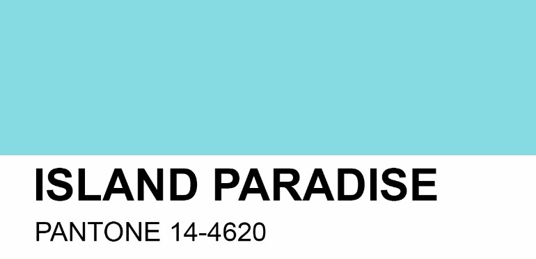
Island Paradise
Island Paradise has got to be one of the freshest and most S/S reminiscent colors of this year. See how great it looks in a modern bedroom!
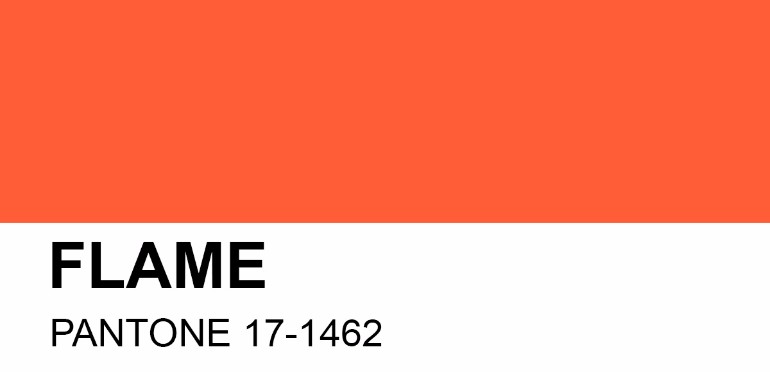
Flame
Fire and fierceness. That’s what Pantone’s Flame tone brings to the table. It’s another great accent color for the upcoming season, that will surely look stunning in a kitchen, dining or living room.
Pink Yarrow
Pink has come strong for the Spring, with it’s Yarrow shade. It’s another bold color that will create many lovers and haters. What do you think about it? Yar or nay?
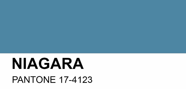
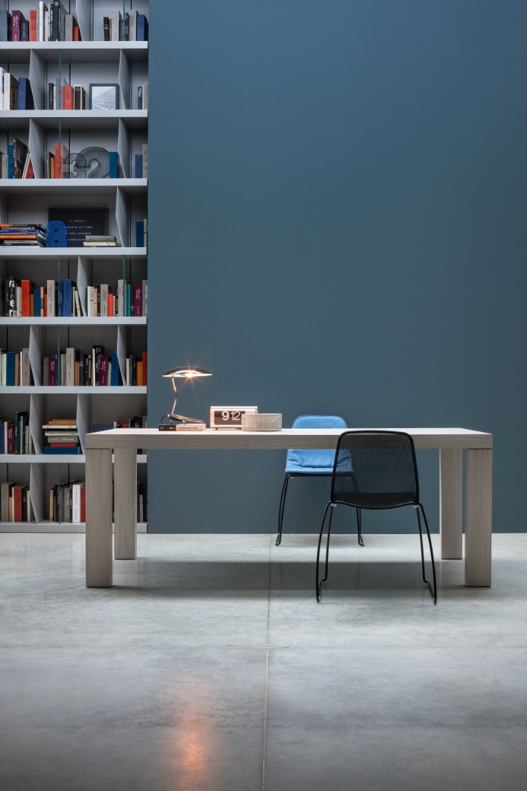
Niagara
Niagara is probably the darkest shade of the whole Pantone color report for the Spring. However, when paired with the other colors, we can understand that it creates a beautiful balance between the fresh, bold and neutral colors.
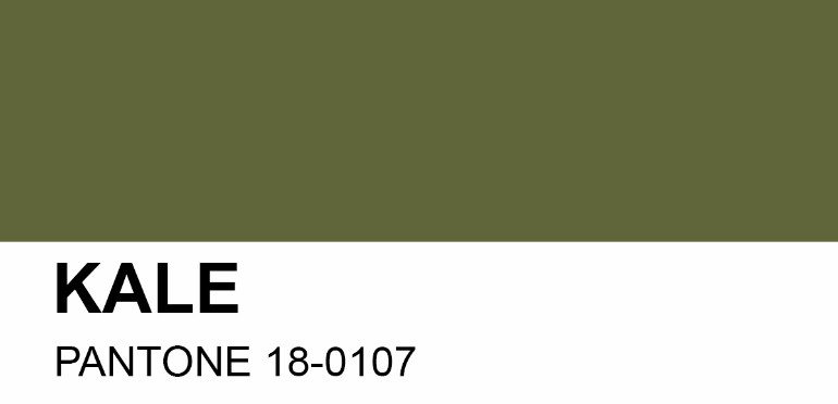
Kale
Not quite what you’d expect for a Spring color, Kale is nevertheless a stunning green shade that can be paired with Greenery for a soberer and toned down look.
Lapis Blue
Another shade that, at first glance, you might not think about as a Spring color, Lapis Blue has a lot of potential as an accent color. We love it the most in a mid-century room, surrounded by raw white and a few green details. Check out the example below!
Photo ©: Contemporist
SEE ALSO: Find Out the Living Room Trends That Need to Go Away in 2017
We hope you liked our article. Feel free to pin all the images to your favorite Pinterest board or to print it and use in your mood board. Don’t forget to explore our Pinterest boards for more Living Room Ideas. Subscribe our newsletter and receive the best tips in your email box.


